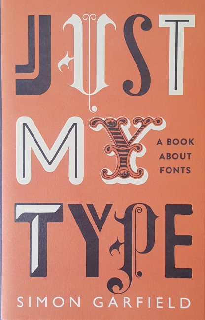
This fascinating book delves into the almost six hundred years of typesetting from Gutenberg with his introduction and popularisation of movable type on the printing press that he invented in the late 1440’s to the modern computer generated pages; whilst discussing the history and development of typefaces and fonts which have grown to well over 100,000 different styles over the centuries. One particular feature of the book is the use of the font referred to for most occasions that a specific font is discussed. This has led to almost two hundred different fonts being used in the book from the black lettering used by Gutenberg and Caxton which looks like the letters produced by monks in handwritten documents and books from the previous centuries to surprisingly recent classic examples which have become ubiquitous such as Helvetica (1957) which has become the font of choice for American transport systems, to its near copy Arial (1982). Arial was deliberately created by the Monotype Corporation to be very similar to Helvetica owned by their rival Linotype and owes its spread to being bundled by Microsoft from Windows 3.1 because the license was cheaper than Helvetica. There is also a chapter on the font developed by Herbert Spenser and Margaret Calvert for British road signs in the 1960’s and which has now spread across Europe, the name of the font is appropriately Transport.
I think anyone with an interest in books develops a parallel interest in fonts especially when the publisher, such as The Folio Society, always includes a reference to the chosen font at the start of the book. We don’t always notice when the choice is done well but certainly do when it is done badly. This is sadly the case with a book I am struggling with currently despite the contents being really interesting the poor paper quality, which is a little grey, along with the faint small thin font utilised makes reading more than a dozen or so pages in one go impossible due to the eye strain resulting from the attempt, Papyrus by Irene Vallejo published in paperback by Hodder & Stoughton is going to have to wait for it’s time on this blog, the subject is great but the reading experience is painful.
Garfield refers to many books about printing in this volume, several of which are now on my wants list including an interesting double book by Paul Felton which started from one direction is called ‘The Ten Commandments of Typography’ but turn it round and start from the other end it becomes ‘Type Heresy’. Amongst the commandments is “Thou shalt not apply more than three typefaces in a document” something that ‘Just My Type’ breaks for excellent reasons. But in ‘Type Heresy’ there is a full page rebuttal to this argument.

Oddly Profile Books who published this volume categorise it as ‘Reference/Humour’ which I think is simply down to the inclusion of this cartoon.

Vincent Connare who created Comic Sans whilst working for Microsoft as a font designer in 1994 is used to the criticism of his best known font design, but all he was trying to do was come up with an approachable design which resembled simple handwriting and was based on the handwritten lettering used in comic books by Marvel and DC at the time hence the name. It is worth noting that Comic Sans, the Sans indicating that it doesn’t have serifs (a small addition to the lines making up the character) on the letters, is particularly popular with teachers of dyslexic children due to its simple nonthreatening style.
The book covers a wide spectrum of fonts and typographical examples from histories of specific fonts in short chapters interleaved within the main text and each entitled Fontbreak, which starts with Eric Gill’s best known font Gill Sans (1928). Through to The John Bull Printing Outfit which I’m pretty certain I never owned although I do remember using something similar as a child to typeset short documents and print my own items. There is also a chapter on the worst fonts in the world which includes the truly awful font designed for the 2012 London Olympics.
So what font am I using for this blog? Well it’s the now somewhat unfashionable Times New Roman, chosen for the same reason that it was developed, to be clear and easy to read even down to small sizes, after all you may well be reading this on your phone. Times New Roman was created by Stanley Morrison in the early 1930’s to improve the legibility of The Times newspaper in Britain which up until then had used the somewhat spindly letters standard across most newspapers since the 19th century. The thickening of the very narrow letters also improved the robustness off the cast metal type, particularly useful given the high speed rotary presses in use.

Unfortunately my Samsung phone does not present your blog in Times New Roman but in it’s own choice!
LikeLike
Wonderful to read about the history of some fonts. My day job is a print graphic designer, so I geek out on fonts 🌞
LikeLike