Designing Terry Pratchett’s Discworld – Paul Kidby

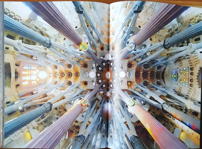
Well I was halfway through the book that will now be the subject of next weeks blog when this arrived and was begging to be read. As regular readers of this blog will know I have been a reader of Terry Pratchett’s work since the very beginning of Discworld back in 1983 and have numerous pictures by Paul Kidby on my walls that attest to that interest, some signed by Paul, some by Terry. For Terry the art of Paul Kidby came the closest to what was in his mind of anyone who has illustrated his works so I was fascinated to read this book, indeed I had ordered it from Paul many months ago and whilst knowing it was to be published in November 2024 had lost track of the actual publication date so when this signed copy dropped through my door on Friday then it just leapt to the top of the to be read list and frankly I haven’t been remotely disappointed. The pages have a high gloss finish, entirely appropriate for the art book that this is, but making them extremely difficult to photograph.

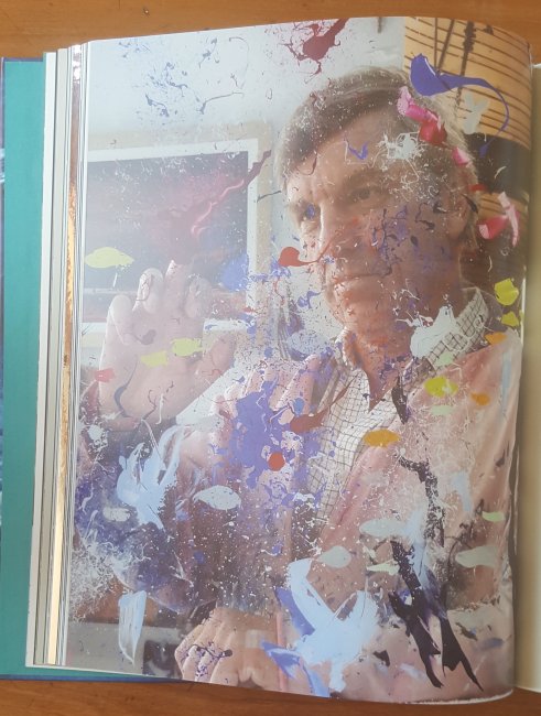
The above picture is of Kidby in his surprisingly bare, and quite small, studio with his dog asleep under his desk. This is from a chapter where we look at the materials he uses to create his art, specific boards, brushes, pencils and paints that he prefers and this is interesting as he explains why he picks particular art supplies. But the vast majority of the book looks at the development of the various characters. All the major characters have at least a page discussing how Kidby came up with the their look and how they have changed over the years, so I’ll feature Lady Sybil Ramkin.

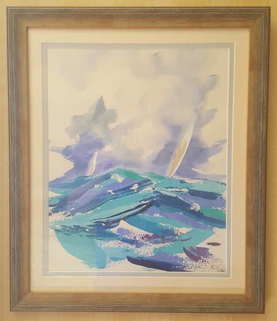
As you can see there is an original sketch which frankly looks more like the Clarecraft version of Lady Sybil than the later iterations by Kidby and there are often handwritten notes like the one featured above adding more details of the artistic influences to the illustrations. One thing I particularly liked was the inclusion of the original art when Kidby does one of his numerous parodies of famous paintings so that you can clearly see where his inspiration came from.

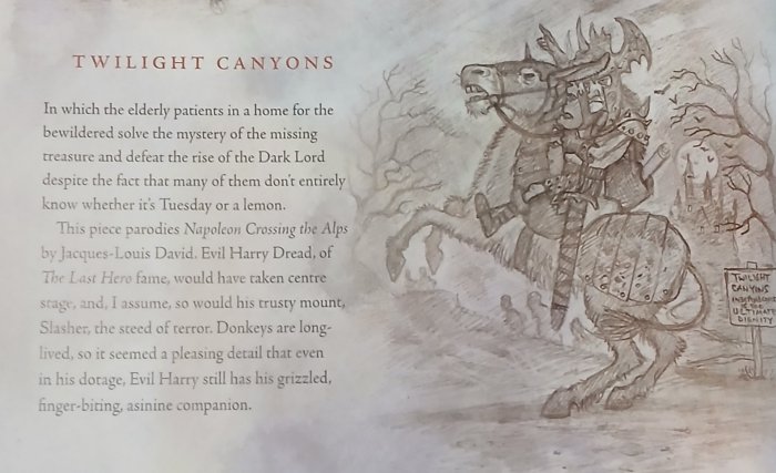
One of the joys of the book however is right at the end in a chapter called ‘The Road Not Taken’ where Kidby has produced a brief sketch for books that never were, Pratchett’s work in progress at the point of which he could no longer write and one of these is Twilight Canyons.

I was in the audience for ‘Bedtime Stories’ at the 2016 UK Discworld Convention, this section had always featured a reading from a book that hadn’t been published yet, initially read by Terry and latterly by his Personal Assistant Rob Wilkins. This was the first convention after Terry’s untimely death and seeing this on the programme had raised a definite buzz of anticipation, what would Rob do? Maybe just tell stories about how he and Terry had worked together and that indeed is how he started but suddenly he reached over for a sheaf of paper and started reading Twilight Canyons, a book that was clearly well in progress but which we would never get to read, the room fell even quieter as we all knew this was our only chance to experience this book.

Right after he finished the quite long extract he removed the On Air sign and the coat to reveal that the ‘table’ beside him was a shredder and he duly dropped the manuscript into the slot of the now working machine, continuing Terry’s wishes that all his unfinished work was to be destroyed. A sad but fitting end.

Rob wrote the afterword to this book where he explains that it is hoped that this will simply be the first in a series of volumes looking at various aspects of Pratchett’s work and I do hope there is more as this was a fascinating book.

Letters from Fairyland – Charles van Sandwyk

Charles van Sandwyk was born in South Africa and raised in Canada; he taught himself calligraphy and intaglio printing as a teenager, his first self-published book appeared when he was just twenty, and won a national award. Since then his work has been archived by the National Library of Canada and rightly so as his art is truly beautiful. Van Sandwyk has produced illustrations for several Folio Society editions but this is the first one I have bought whilst taking advantage of the end of year half price sale they were running which meant that I only paid £25 rather than the £50 original. However having now got a copy I’m thinking about the ones I have missed, such as the limited edition of Alice in Wonderland which was published by The Folio Society to mark the 150th anniversary of the first edition and sold out rapidly. Sadly I can’t see me being able to obtain original books by Van Sandwyk as they are produced in tiny numbers and are mainly snapped up by collectors in Canada so the Folio Society editions will have to do.

The story goes that many years ago a young artist living in Canada received, out of the blue, a letter from a nine year old English girl, Miss Emma Gladstone. Emma had read some books about fairies which the artist had published and she was writing to ask his advice about the little people who she sometimes could see out of the corner of her eye. She wanted to invite the fairies to come and live in her garden, but she did not know how to make contact with them. The pull out letter is included in a folder, just the first of several items that can be taken from the book and examined by the reader and this is one of the many charms of this edition which includes the gorgeous Modigliani Neve paper that it is printed on which resembles a heavy duty watercolour paper and perfectly sets the beautiful illustrations.

The artist replied with a letter to Miss Gladstone and the book goes on to tell the story of how he had received a summons from the Royal High Secretary to the King of the Fairies, commanding him to paint His Majesty’s portrait; how he had shrunk in size and travelled to Fairyland in a coach drawn by a mouse, and everything that happened to him there. The first edition of the book was published in an strictly limited edition of 200 copies which Van Sandwyk presented to members of an exclusive club, the High Branch Society, which unfortunately I have been unable to find out anything about. The double page spread above includes the finished portrait and an envelope containing fairy money which was apparently Van Sandwyk’s payment. The Folio edition explains that it is an expanded version of this original volume being twice the length but even so it is a very short book being just twenty four pages long, excluding the individual pull out items and it was this very shortness that made me originally hesitate to purchase it as it worked out at just over £2 a page. But it is so lovely that I should have really have got it sooner and treated it as an art purchase rather than a book.

Sadly the Folio Society sale has obviously tipped a few others into making the purchase so the stock of this, the 2020 first edition in this form has now sold out. If this little book has piqued your interest in Van Sandwyk’s work as much as it has mine then you may find the following link useful, I certainly had a great deal of fun exploring other works by this wonderful artist.

Wall and Piece – Banksy

Iconic and famously anonymous graffiti artist Banksy first wrote about his works in three small books just 148mm x 105mm (5.8″ x 4.1″) Banging Your Head Against a Brick Wall came out in 2001, Existencilism in 2002 and Cut it Out in 2004. I bought Banging Your Head Against a Brick Wall when it came out but unfortunately missed the other two which were also published by Banksy’s own Weapons of Mass Distraction publisher. I say unfortunately because you cannot pick up any of these for less than £100 each nowadays. Far easier to find is the subject of this weeks blog Wall and Piece first published in 2005 by Century, part of the Random House group, and much larger at 257mm x 210mm (10.1″ x 8.3″) and 240 pages and which is in full colour unlike the small black and white only books which are just 48 pages long.

As for the ‘Now with 10% more crap’ sticker on the cover, my edition is the 9th impression and talking to a friend who has an earlier version, without the sticker, she confirmed that my copy is noticeably thicker than hers. We haven’t done a page by page comparison to establish the additional material but it was clearly an evolving project and I would have expected this to be a second edition rather than the 9th impression of the first. Wall and Piece, as a mass produced book running into multiple print runs is unsurprising quite cheap to find second hand, costing just a few pounds although I bought it new from a book shop and paid full price (£12.99) for mine.

The art is roughly in chronological order, starting with his chimp wearing a tabard with assorted messages on it to his rats which is when he really started to be noticed with his instantly obvious style and sense of humour. It is probably the fun in what he does that makes him so different to the vast majority of graffiti artists and which makes him so collectable with one of his works recently selling for £18.5 million, including premiums at auction. But this book takes us back to the beginning and he explains where the idea for the stencils came from, he was trying to paint ‘LATE AGAIN’ on the side of a train and taking far too long about it so that the police arrived and he only avoided being caught by escaping through thorn bushes and then hiding under a dumper truck. Looking up he saw the stencilled plate on the base of the fuel tank.

I got home at last and crawled into bed next to my girlfriend. I told her I’d had an epiphany that night and she told me to stop taking that drug ‘cos it was bad for your heart.

More rats, and this shows how he makes use of existing things on the walls he paints on either because it’s funny as in this example or because he is trying to make a more serious point. The vast majority of his works in the past have been either painted over or simply cleaned off the wall involved so it is the photographic records that are his lasting legacy. Most recently, due to the considerable value of his authenticated works, huge sections of wall have simply been removed and presumably sold such as the seagull art in Lowestoft taken earlier this month, see here.

The newest works in the book are from 2005, which is when the book was first published, and feature the works that Banksy, and a team of helpers, painted on the segregation wall illegally built by Israel through the occupied West Bank, the one above is near the checkpoint in Ramallah. They mainly appear to be holes in the wall with attractive views, one has a mountain range, another a tropical beach although one looks simply like the dotted line with scissors used to surround items to be cut out from printed items, this particular image is over twenty feet high. Although the paintings are largely appreciated by the inhabitants Bansky describes the wall in the book as something that “essentially turns Palestine into the world’s largest open prison.”

Old Man You paint the wall, you make it look beautiful
Me Thanks
Old Man We don’t want it to be beautiful, we hate this wall, go home

One section I particularly like deals with his re-interpreted art such as Sunflowers (from a Petrol Station) seen above. Banksy has managed to hang his parodies in numerous famous galleries by simply walking in and putting them up usually with explanatory cards in the form used by the gallery itself. These establishments include The Tate Gallery in London, The Louvre in Paris, The new York Metropolitan Museum and the Natural History museums in both London and New York amongst others. In the book these works are often accompanied with various photographs of Banksy hanging the ‘fake’ painting, the pictures normally survive on the walls for a few hours before being removed after which they have been discarded by the gallery or more recently added to their own collections.

Above is part of the rear of the book which not only completes the image on the front where the masked man is shown to be throwing a bunch of flowers rather than the Molotov cocktail that might have been expected from first impressions but also includes a quote from the Metropolitan Police, London’s police force, which may or may not be genuine.

Finally below is the book that started it all, a lot of the images from ‘Banging Your Head Against a Brick Wall’ are also in Wall and Piece but in colour and much larger than could be achieved in such a small book. Surprisingly though there is a quite a lot of text in this small volume whilst Wall and Piece is largely a picture book, although it does include quite a bit of information about the various styles he has used and little bit of biographical detail but not enough to come any where near identifying him. There are also hints for how to do your own stencil graffiti in a few pages at the back and some introductory paragraphs at the start of each section.

The Man and His Paintings – David Shepherd

The paintings behind David Shepherd in the cover photograph are some of his best known works, ‘Black Five Country’, ‘The Four Gentlemen of Tsavo’ and ‘Winter of 43, Somewhere in England’. These three works represent the three subjects for which he is most famous, the end of steam railways, wildlife (especially elephants) and aircraft. This large format book (33cm x 24½cm) was first published in 1985 by David & Charles and is now sadly long out of print as are the other titles featuring his work that they published. The book consists of approximately five thousand words by Cyril Littlewood, founder of the Young People’s Trust for Endangered Species by way of an introduction to David Shepherd and his work and roughly twenty to twenty-five thousand words of biographical detail by Shepherd himself plus often comprehensive descriptions of each of the sixty one featured paintings along with numerous sketches in both black and white and colour.

As can be seen in the two examples, above and below these paragraphs the book’s format is simple and elegant. Each featured painting is reproduced on the right hand page whilst the description by David as to how he came to produce the work is on the facing page with sketches filling in the page if there is room. In many cases the story he is telling about how the work was produced or received by the public or the commissioning client fills the page so there is no room for an additional sketch. It’s hard to believe that these paintings are the work of somebody who was rejected by the Slade School of Fine Art as having ‘no talent whatsoever’ when he applied to study there. As he explains in the biographical section of the book that he subsequently made his career in art at all was down to a chance meeting with professional artist Robin Goodwin at a party and despite Goodwin agreeing with the Slade he did agree to try to teach him.

Shepherd started off his commercial art three years after starting training with Goodwin and was painting aircraft. initially civilian and then military with several of his works hanging in the Officer’s Mess of various UK regiments but his big break came when he was flown out to Africa by the Royal Air Force and they didn’t want pictures of planes, as they saw enough of them, what they wanted was the wildlife and so he painted his first elephant and that really started his career. His very first career plan was to be a game warden in Africa and in fact he even flew out to Kenya as a young man and presented himself as prospective employee at a reserve only to be told to go home as they didn’t need an untrained and callow youth getting in the way of their work. Painting the wildlife many years after that initial rejection brought his early interest in conservation to the for and he would go on to raise a huge amount of money by selling wildlife prints for charity.

Shepherd’s fascination with steam trains went far beyond painting them, he actually purchased two from British Rail as they were being withdrawn, restored them to their original beauty and ran them on ‘The East Somerset Railway’ a preserved line he helped set up, although both locomotives are now owned by ‘The North Yorkshire Moors Railway’ another preserved line. Although I was first drawn to Shepherd’s works via the wildlife paintings it is his work showing the last days of United Kingdom steam that I most admire now. The book was really interesting in that it showed the development of his career from aircraft art which he often couldn’t sell even for £25 to the massively successful prints which really made his name with the general public. Nowadays you would need to spend in the order of £100,000 to purchase a Shepherd original although few of them are on the market. Sadly David Shepherd died in 2017 at the age of eighty six but the foundation he set up to continue his charitable work has raised over a million pounds over the years and continues to do excellent work with wildlife conservation in Africa and Asia.

Gaudi The Complete Works – Rainer Zerbst

There are very few architects where one glance at a building is enough to tell you that they were involved. Probably the most distinctive of this small group is the great Catalan architect Antoni Gaudi i Cornet, whose masterwork, the Sagrada Familia Basilica in Barcelona is still under construction 137 years after he took over the project and 94 years after he died. It is hoped that the six huge steeples will be completed in time for the centenary of his death and when I last saw it earlier this year that certainly looked like a possibility as they had risen considerably since my previous visit. The double page spread below is looking straight up at the ceiling of this truly remarkable building.

Published by the German art publisher Tashen there are two versions of this book, both in hardback. Mine is the larger one at 25 x 34 cm with 368 pages and weighing 2.91 kg, there is also the much smaller 40th anniversary edition which is 15.6 x 21.7 cm and almost half the weight at 1.47 kg. The number of pages in the smaller edition is higher, presumably to get all the text in at a readable size, because although this is a wonderful book of full page images there is also a lot of text providing a good length biography and extensive notes about each featured building. Part of the reason for the weight of my copy is the use of very high quality paper which is a hallmark of Taschen’s publications. I also feel that to do justice to Gaudi’s remarkable structures you need as large an image as is practicable so would very much recommend this version, which costs £40 rather than the 40th anniversary edition which is half the price but not as impressive a volume.

The book is split into three sections and the pages are colour coded within these parts. Initially there is an introduction which along with the historical summary also provides short essays on significant projects. This part is on ‘normal’ white background pages with black text. Following this comes the main body of the book with in depth analysis of sixteen buildings, or groups of buildings in the case of Güell Park, which each get between fifteen and twenty pages dedicated to them. These parts each have an initial page on gold paper with black text followed by black paper with white text. The final section summarises Gaudi’s complete works with each piece from furniture to the less important buildings briefly discussed and printed on gold paper with black writing. This part also includes a short biography and pages of photo credits.

The mixing up of the coloured pages sounds like it could be a mess of a book but in reality it is beautifully designed and certainly has a wow factor from the moment you first open it. When I showed it to a friend of mine that runs a bookshop she ordered a copy for herself that morning it has that sort of impact. I was given it for my birthday, in June, and have only just finished reading it. Not only are there so many fantastic images to look at but there is a large amount of text to provide a lot of information about Gaudi and his works. The book really does live up to it’s subtitle of The Complete Works and is surprisingly readable despite the level of detail that it goes into.

I first started specifically buying books by Taschen, rather than just picking up random titles as and when they caught my eye, when they began a series called Taschen’s World Architecture in the the 1990’s. This was intended to be a forty volume set exploring everything from ancient Egypt and Greece through to the modern age and genuinely trying to cover the world rather than just a Euro-centric view. Unfortunately it clearly wasn’t successful, some of the planned volumes were obviously going to have a limited readership, which is probably why 250 page high production value books at a sensible price had not come out before. In the end only twelve of the projected volumes were actually produced and the last couple tended to be found mainly in discount retailers as they were remaindered, which made tracking them down to complete what I could rather difficult. I will review these excellent books in a blog entry sometime next year

Despite the failure of that series, architecture is still a mainstay of Taschen’s publishing output and I hope that reading this blog has perhaps whetted your appetite to seek out some of their beautiful books. Even if you don’t have a major interest in architecture then they are still really interesting and gorgeous to look at. But be aware they are not for bedtime reading, they tend to be large and heavy, the next Taschen publication I intend to cover on this blog clocks in at a massive 7.56kg and will highlight another branch of their output. Until then enjoy the images I have selected here and maybe get a copy yourself.

List of images selected for this blog:

  • Cover – Detail from Güell Palace
  • The ceiling from the aisle of Sagrada Familia
  • Top of the tower at El Capricho near Santander
  • Güell Palace – interior view, Gaudi would not only design the physical structure but also the fixtures and fittings inside to continue his design throughout the building
  • Bodegas Güell – this astonishing triangular cross-section building is the wine cellars for the Güell family
  • Park Güell – view from the terrace looking back at the entrance gates and buildings
  • Casa Batlló – One of the staircases
  • Gold page below – Casa Pere Santalo, in this case Gaudi renovated the facade rather than designed the building but still made it distinctively his own

Making Waves – Duncan MacGregor


20200616 Making Waves 01

Like another artist whom I featured before in this blog, Sir Robin Philipson, Duncan MacGregor has painted a lot of the art on my walls at home, I like his almost abstract seascapes where with a few apparently simple lines he can express the scurrying movement of a yacht in full sail. In 2013 he wrote this book which along with examples of lots of his work includes a fascinating biographical sketch as to how a boy from the English midlands ended up as a seascape painter and nowadays living for the most part in Scotland away from his native Birmingham. The book is published by DeMontfort Fine Art and is 34cm x 28½cm and came in three editions:-

  • Standard edition, unlimited book at £65
  • Limited edition, book in a box with a signed limited edition print and certificate numbered between 151 and 595 at £165
  • Deluxe edition, book in a box with a signed limited edition print along with an original sketch and certificate numbered between 1 and 150 at £495.

The box for the special editions, both limited and deluxe which is the version I have, has a frame built into the lid which held the print and if appropriate the original painting.  The print that came with all 595 limited or deluxe editions is shown below.

20200616 Making Waves 02

I have left this with the book in the box however I have framed the original sketch as I wanted that on my walls.

20200616 Making Waves 05

Although there is quite a lot of text, this is primarily an art book so it is the lovely photographs that draw the reader in and despite the relatively large size of the book there are some fold out pages as well so you can really appreciate the paintings featured

20200616 Making Waves 09

Paintings also extend over the central page boundary at times so that they use the full height of the page and spread if needed to show the full image whilst included photographs are much smaller. Below are a couple of double page spreads showing Duncan with a couple of his boats. Note the doodled fish in the margins of the lower image, there are little bits of humour like this throughout the volume.

20200616 Making Waves 1020200616 Making Waves 07

I particularly like the use of multiple fonts throughout the book which complement the artworks beautifully and there are also some double page images with doodles and handwriting in white on a black background just to play with the print format further

20200616 Making Waves 08

At the time the book came out MacGregor was experimenting with painting direct onto glass and one of the illustrations shows him at work seen through the panel he was painting. This is obviously complex as effectively the artwork is done backwards, with the foreground and highlights painted first and then gradually covered with the subsequent layers of paint until he reaches what would normally be the first layer of paint on a canvas which is applied last. It does produce an amazing glossy effect though in the finished piece.

20200616 Making Waves 14

As a final view here are three of his original paintings that are hanging here. Click on an image to see it larger.

Hansel and Gretel – Simon Armitage

This was not the book I expected to be writing about at the beginning of June as the publication date is not until the 24th of this month, but on the 31st May a wonderful package arrived and I couldn’t help abandoning what I had been reading and starting on this beautiful volume straight away.

20190604 Hansel and Gretel 1

Simon Armitage has just been made the Poet Laureate for the next ten years and this is therefore his first newly published work since that honour. The poem originally appeared as a ‘libretto’ to a puppet production designed and directed by Clive Hicks-Jenkins which toured England between July and November 2018 but this is its first book publication.

You can see the entire production with the darkly appropriate music by Matthew Kaner, performed by the Goldfield Ensemble here

Clive Hicks-Jenkins has produced a wonderful series of illustrations for this book published by Design For Today. These are clearly based on the theatre production without being limited by his original work.

20190604 Hansel and Gretel 3

The subtitle of the poem is ‘A Nightmare in Eight Scenes’ as the Hansel and Gretel story has been re-interpreted as a modern tale of refugees from a war zone. Without giving too much away the family are starving as the bombs rain amongst them at the start of the book and the parents decide to at least get the children away from there to somewhere where they stand more chance of survival. Hansel and Gretel though mishear their parents planning and think they are simply to be abandoned. This is not the only time that mishearing becomes a plot device in the poem.

As in the original Brothers Grimm tale there is a ‘witch’ and a gingerbread cottage, a trail of stones, a trail of breadcrumbs and abandonment to avoid famine followed by a return only this time without the treasure that would lead to a happy ending. In the modern world of war meted out against helpless civilians there is rarely a happy ending…

The illustrations fit the text so well and the design of the book is beautifully done. I particularly like the colour coding of the words so that you know who is speaking, each character has their own colour as specified in the cast list at the start.

20190604 Hansel and Gretel 2

Oddly I’d never read any Simon Armitage before this but I will definitely be seeking out more of his work. According to his website there are a lot of books to check out

The total production run of this book is two thousand copies, of which one hundred form a further limited edition signed by Simon Armitage and Clive Hicks-Jenkins and which include two extra art prints. Mine is copy number twenty two.

20190604 Hansel and Gretel 4

It’s been a year

I have kept this weekly blog now for just over a year and I thought I would take the opportunity to look back at the entries and see if it can give me some ideas as to which books to talk about next. To my surprise the top five liked entries as I write this are all related to Scotland

20190122 it's been a year 1

William McGonagall wrote excruciatingly bad verse about Scotland and the people there and was a proud resident of Dundee, eventually Dundee has become proud of him as well. Iain Banks was another Scotsman through and through and the book I reviewed was his homage to the land of his birth. Shaun Bythell’s book was one of the first things I wrote about so his diary of keeping a Scottish bookshop going has had a whole year to accumulate its tally of likes whilst I only wrote about Elizabeth Cummings book about Scottish artist Sir Robin Philipson a couple of weeks ago and it has already made it to number five. You may have noticed I skipped Robert Service, he was also Scottish although found fame as a poet in Canada however I left him to last as he highlights another trend in popular posts here and that is poetry.

This is even more obvious when I look at the next five entries…

20190122 it's been a year 2

The Frogs is a classical Greek play in verse, Persian Poets is clearly about poetry and Under Milk Wood is a poetic masterpiece by Dylan Thomas, this makes half of the top ten liked entries are about poetry although there is nowhere near that percentage represented in the total number of essays I have produced so far.

The remaining two are interesting. The Royal Tour is a beautifully illustrated diary of a cruise around a lot of the then British Empire and Uncle Jim is a bit of a sleeper as it deals with the early output of fantasy author Sir Terry Pratchett but without mentioning him in the title so you had to read the article to find out.

There are other statistics available that don’t display on the front page so aren’t visible to readers of the blog and from those I can see that Deep in the Forest – Estonian Folk Tales is looked at more often than any other entry and it is viewed from all over the world, as opposed to my other Estonian review of the Apothacary Melchior books which also gets quite a few readers but 90% of these are in Estonia or Finland. Only one entry has not been read by anybody according to the statistics available and that is The Tempest by William Shakespeare. Sorry Will although I have all your plays several times I don’t think you are going to be featured here again.

So what does all this tell me? Well poetry is definitely popular here and that’s good as I also like poetry and have quite a few more poets to write about, one of which will probably be in the next four weeks. Bearing in mind the Scottish bias as well I suppose I had better get the volume of Robert Burns I have from 1946 out and reread that soon.

The Frogs by Aristophanes was a surprise hit, to me at least, so we will see how next weeks entry, which is also classical Greek, goes down. I have a lot of ‘the Classics’ and am also planning a review of a book dealing with the subject of what makes a classic in the next month or so. Art and Design has also been popular and again this is something I have a lot about in my library so expect more of those subjects in the coming year.

But is there anything you would like me to write about? Not specific books, as according to the rules I set myself I have to own the title to write about it so you would have to be really lucky to hit one of the 6,500 titles on my shelves, but general subjects. I haven’t done much on Travel and Exploration but what has been done has been generally well received, should I do more? Any suggestions would be good either as a comment below or as a message through the site.

Robin Philipson – Elizabeth Cumming

This is the first of my ‘what I got for Christmas’ posts and this book was a wonderful surprise from some very good friends. I first saw Robin’s art at their home and loved it straight away so that I have bought several pieces over the ensuing years, some of which I am using to illustrate this essay rather than images from the book itself.

20190101 Robin Philipson 1

Sir Robin Philipson RA RSA FRSE RSW to give him his proper title was a major name in Scottish art through the second half of the 20th century; not only as a creator of beautiful works but as a teacher for many decades at the Edinburgh College of Art. There have been a couple of biographies before, along with pamphlets to accompany exhibitions, but this is easily the most comprehensive biography so far. Cummings has spoken to lots of members of Robin’s family including his widow Diana and also his nephew who gave me this lovely book.

20190101 Robin Philipson 2

As this was a Christmas present it is appropriate to start with a couple of Robin’s Christmas cards on my walls. What can be immediately seen is his bold use of colour, as Dr Cumming says in her book.

…colour was always a principle tool in Robin’s art, and it evolved throughout his career; he was one of Scotland’s major colourists. It was this as much as technical experiment which drove all his work; whether easel painting, printmaking or his involvement in textile enterprises…

Robin produced a Christmas card every year from the late 1960’s, not only painting the original but also printing the cards, en masse they look fantastic, I only have three but hope to add others to my collection as time goes on.

The book’s cover picture is entitled Brenda Spring Portrait, she was his first wife, they married in 1949 a couple of years after he took up his first role as lecturer at the Edinburgh College, and he painted her several times. The Summer and Winter portraits are also included in the book along with a very interesting study for the Spring portrait. One of the joys of this volume is the inclusion of studies for works along with pictures of Robin in his studio which gives an opportunity to see how he went about some of his pieces.

The book is split into several sections, part one looks at his early life and how he came to be in Scotland in the first place; he was born in Cumbria in 1916. Part two is the longest and takes us from starting teaching and his marriage to Brenda, to his discovery of the joys of print making and the introduction of three of his main themes, cock fighting, kings and cathedrals.

20190101 Robin Philipson 4

My largest piece and one that hangs above my desk can be seen above, limited to 50 and signed by Robin it is also my favourite in it’s bold use of colour and dynamism of the subject.

20190101 Robin Philipson 5

The book is copiously illustrated and includes a significant number of works that are held in private collections so not generally seen, it also gives me a chance to roughly date the art I have collected as style and themes develop through the book as we move through Robin’s career.

He designed the posters and programme covers for the Edinburgh Festival in both 1958 and 1959, the book includes examples of both programmes and in my collection I have an original (and highly fragile) poster for 1959 which is a really good example of his style at the end of the 1950’s.

Part three takes us from the early death of Brenda from a brain tumour in 1960 which led to a period where very few works were produced and those that did appear are dark and angry in tone to meeting Thora Clyne who was to become his second wife in 1962. This seems to have led to a blossoming of Robin’s art and he also took up the appointment of head of Drawing and Painting in the early 1960’s so became very busy.

20190101 Robin Philipson 3
I have a couple of versions of Peasant, which dates from 1958 and are different sizes, only one of which is signed, I really like this happy character and he also hangs above my desk where I am writing this.

He did manage to fit in a trip to Colorado in the summer of 1963 as a visiting Professor of Art in Colorado. During this time he became influenced by native paintings and also Mexican churches, there is a truly beautiful painting of a yellow altar towards the end of that section.

The fourth section of the books sees another theme emerging in Robin’s art as we complete the 1960’s and that is depictions of crucifixion. This is a logical extension of his works depicting church interiors , specifically rose windows, and the altars he had started painting in the early part of the decade. Again Cummings takes us through the change in his art against the changes happening in his life and explains how they fit together.

The fifth part covers most of the 1970’s, from his surgery for colonic cancer whilst on a trip to France to study tapestries through his divorce from Thora and marriage to Diana. This was a period not only of great creativity and more new themes to his work such as ‘human kind’ which depict inter-racial couples in various settings to his numerous paintings of ‘women of pleasure’; but also of much greater recognition in the world outside of the Scottish Art scene. He became president of the Royal Scottish Academy, a post he held for a decade and from that a fellow of the Royal Academy in London. In 1976 he was knighted for services to art and all whilst heading up the Drawing and Painting department at the Edinburgh College of Art. He would continue to have bouts of illness throughout this period but his workload and artistic output hardly seemed to let up.

The final section deals with the last fourteen years of Robin’s life up to his death in 1992, this was still a highly busy and productive time with yet another theme to his art appearing, the wonderfully delicate poppy still life paintings.

20190101 Robin Philipson 7

I have a couple of these prints, both signed, as my representations of this period and there are three originals reproduced in the book with various backgrounds which demonstrate his total mastery of colour. Sadly the cancer first detected in the 1970’s was to claim him just when it looked like he was reaching another peak in his creativity. I have more pictures by him than I have used in this short review and am always looking for more to add to my small collection especially now I have seen some of the works in this beautifully illustrated book.

All in all this is a major retrospective of the life and work of a man who became very important figure in Scottish art for several decades and hopefully it will help raise his profile again twenty five years after his death. The main body of the book (excluding chronology, notes and index) is 138 pages long, sixty nine of which are made up of full page (and indeed double page) illustrations and a large proportion of the text pages also have a picture or two on them, this really is a magnificent review of Robin’s works and for the most part is extremely readable. My one criticism is the impression you get that Cummings wants to prove she has done her research which leads to whole paragraphs which seem to consist of nothing but lists of names and dates which you hit like boulders in the stream of an otherwise flowing tale. Having said that I very much enjoyed the book and will finish this overview with my only Philipson original, a small pastel still life.

20190101 Robin Philipson 6

The Moomins and the Great Flood – Tove Jannson

Most people who know Tove Jansson’s wonderful Moomin books have come across the eight books starting with Comet in Moominland (1946) and ending with Moominvalley in November (1970), a smaller number of people will have seen the five picture books for younger readers (1952 – 1993) only four of which have been translated into English and which will probably be featured in a blog on here sometime next year. Fewer still will have seen the long running cartoon strip which I covered in a previous blog. And then there is the subject of today’s post.

20181211 Moomin and the Great Flood 1

The Moomins and the Great Flood has a very odd history it began life in 1939 at the start of WWII when twenty five year old Swedish speaking, Finnish born artist Tove Jansson, faced with a lack of inspiration for her work decided to try writing something. As she herself said in 1991

It was the winter of war, in 1939. One’s work stood still; it felt completely pointless to try to create pictures.

Perhaps it was understandable that I suddenly felt an urge to write down something that was to begin with “Once Upon a Time.”

Inspiration didn’t really strike with the written word either and the part written story was put away to be largely forgotten until she showed it to a friend in 1945 who encouraged Tove to finish it as a children’s book and do some illustrations to see if it would sell. The original title in Swedish is Småtrollen och den stora översvämningen or Small trolls and the Great Flood and although the following eight books became hugely popular all over the world from the 1950’s and have spawned a massive merchandising industry this first appearance was rather neglected. The book was out of print for a long time and did not get translated until 2005 when a limited edition copy was produced in English for the 60th anniversary of it’s first publication. This translation however was printed in Finland and was not widely available outside that country, the edition I have is printed by Sort Of Books in 2012 and is the first copy that is easy to obtain.

20181211 Moomin and the Great Flood 2

So why was this book missed out when the others took off, well the first thing you notice is that it doesn’t seem to be very consistent with the others, this is clearly Tove finding her way with the characters. Here the Moomins are absolutely tiny as can be seen in the picture above where Moominmamma and Moomintroll encounter Sniff for the first time, although he is never named in this book being referred to as ‘the little creature’ throughout. The flower that Moominmamma is holding is far bigger than she is, now it has to be said that nowhere in any of the other books is a size given for Moomins but I was really surprised to see this picture as in the later illustrations Moomins and the other characters are normally interacting with things that are to the same scale as themselves so I had never thought about how tall they are before. A later picture in this book shows Moomintroll riding on a stork looking for survivors of the flood

20181211 Moomin and the Great Flood 3

and this also shows him as very small. The other difference is the lack of recognisable characters, apart from Moominpappa who only makes an appearance at the end only Sniff, Moomintroll and Moominmamma and the Hattifatteners are ones we know, no Snork Maiden, Snufkin, Hemulen etc. all these wouldn’t appear until Comet in Moominland.

The back story given in this book that Moomins lived with House Trolls in peoples homes and would be behind the tall stoves that used to be so common in Scandinavia and they didn’t like central heating as there was no nice warm place to hide.

“Did the people know we were there?” asked Moomintroll

“Some did,” said his mother “They felt us mostly as a cold draught on the back of their necks sometimes – when they were alone”

As far as I can remember this is the only time an interaction with humans is mentioned in any of the books. Ultimately after numerous adventures they find Moominpappa although he has lost the house that he built as it was washed away in the floods only to find it again in a different place that became Moominvalley. The house is shaped like an old stove as a memory of the way Moomins used to live and the next book continues the story from this point.

20181211 Moomin and the Great Flood 4

It’s a pity that although the book is now available in English as well as the original Swedish that there don’t appear to be other translations yet so the worldwide Moomin fans are still largely unaware of how the Moomins started, the full page pictures are beautiful and so unlike any of the books to come after this and deserve to be appreciated everywhere.