Just My Type – Simon Garfield

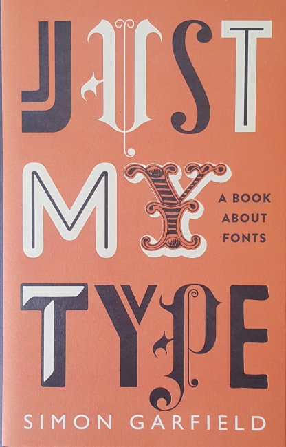
This fascinating book delves into the almost six hundred years of typesetting from Gutenberg with his introduction and popularisation of movable type on the printing press that he invented in the late 1440’s to the modern computer generated pages; whilst discussing the history and development of typefaces and fonts which have grown to well over 100,000 different styles over the centuries. One particular feature of the book is the use of the font referred to for most occasions that a specific font is discussed. This has led to almost two hundred different fonts being used in the book from the black lettering used by Gutenberg and Caxton which looks like the letters produced by monks in handwritten documents and books from the previous centuries to surprisingly recent classic examples which have become ubiquitous such as Helvetica (1957) which has become the font of choice for American transport systems, to its near copy Arial (1982). Arial was deliberately created by the Monotype Corporation to be very similar to Helvetica owned by their rival Linotype and owes its spread to being bundled by Microsoft from Windows 3.1 because the license was cheaper than Helvetica. There is also a chapter on the font developed by Herbert Spenser and Margaret Calvert for British road signs in the 1960’s and which has now spread across Europe, the name of the font is appropriately Transport.

I think anyone with an interest in books develops a parallel interest in fonts especially when the publisher, such as The Folio Society, always includes a reference to the chosen font at the start of the book. We don’t always notice when the choice is done well but certainly do when it is done badly. This is sadly the case with a book I am struggling with currently despite the contents being really interesting the poor paper quality, which is a little grey, along with the faint small thin font utilised makes reading more than a dozen or so pages in one go impossible due to the eye strain resulting from the attempt, Papyrus by Irene Vallejo published in paperback by Hodder & Stoughton is going to have to wait for it’s time on this blog, the subject is great but the reading experience is painful.

Garfield refers to many books about printing in this volume, several of which are now on my wants list including an interesting double book by Paul Felton which started from one direction is called ‘The Ten Commandments of Typography’ but turn it round and start from the other end it becomes ‘Type Heresy’. Amongst the commandments is “Thou shalt not apply more than three typefaces in a document” something that ‘Just My Type’ breaks for excellent reasons. But in ‘Type Heresy’ there is a full page rebuttal to this argument.

Oddly Profile Books who published this volume categorise it as ‘Reference/Humour’ which I think is simply down to the inclusion of this cartoon.

Vincent Connare who created Comic Sans whilst working for Microsoft as a font designer in 1994 is used to the criticism of his best known font design, but all he was trying to do was come up with an approachable design which resembled simple handwriting and was based on the handwritten lettering used in comic books by Marvel and DC at the time hence the name. It is worth noting that Comic Sans, the Sans indicating that it doesn’t have serifs (a small addition to the lines making up the character) on the letters, is particularly popular with teachers of dyslexic children due to its simple nonthreatening style.

The book covers a wide spectrum of fonts and typographical examples from histories of specific fonts in short chapters interleaved within the main text and each entitled Fontbreak, which starts with Eric Gill’s best known font Gill Sans (1928). Through to The John Bull Printing Outfit which I’m pretty certain I never owned although I do remember using something similar as a child to typeset short documents and print my own items. There is also a chapter on the worst fonts in the world which includes the truly awful font designed for the 2012 London Olympics.

So what font am I using for this blog? Well it’s the now somewhat unfashionable Times New Roman, chosen for the same reason that it was developed, to be clear and easy to read even down to small sizes, after all you may well be reading this on your phone. Times New Roman was created by Stanley Morrison in the early 1930’s to improve the legibility of The Times newspaper in Britain which up until then had used the somewhat spindly letters standard across most newspapers since the 19th century. The thickening of the very narrow letters also improved the robustness off the cast metal type, particularly useful given the high speed rotary presses in use.

The Madman’s Library – Edward Brooke-Hitching

In July last year I wrote about the second book published by Edward Brooke-Hitching, ‘The Phantom Atlas‘, this more recent volume, first published in 2020 was a gift I received least Christmas, Brooke-Hitching is the son of an antiquarian book dealer and his love of books shines through in this guide to some of the oddest works ever produced from books like The Blood Quran which was written in beautiful calligraphy using around fifty pints of Iraqi dictator Sadsam Hussain’s blood as a major constituent of the ink in 1997 to ones that use arsenic as the dye for the covers so could literally kill the reader as the poison leaches from the boards. It is six years to the day since I started this blog and I think this book about books is an appropriate subject to mark this milestone of three hundred and fourteen articles and almost three hundred thousand words about books in my own library.

The book starts with a fascinating history of books and their precursors such as clay tablets or Sumerian foundation cones along with parchment scrolls including one that was used to wrap an Egyptian mummy. Then there are books that conceal other things such as one with a built in gun for self defence or astronomical equipment or objects that look like books but are actually boxes made from a specific wood with leaves and seeds from the tree inside them. I was reading about these and thinking it would be interesting to own one when the author pointed out the smell of decay that goes with them which somewhat put me off. There is also a long section on literary hoaxes such as biographies of people that didn’t exist or travel books of journeys that never happened several of which I am tempted to track down examples of.

There are further sections on books of the occult and religious oddities which include some of the strange animals depicted in medieval manuscripts and then examples of tiny and gigantic books. I have a love of tiny books, see my blog on the Lilliput Press so this section was particularly interesting and whilst I do have huge books such as the Folio Society’s Temple of Flora I don’t have anything like the atlas made for Charles II which is 1.76 metres tall and 2.3 metres wide when opened and is truly spectacular. There is a special mention in this section for the classic Audubon work ‘The Birds of America’ which exists in several editions but which is most prized for the version where all the birds are depicted life size which as this includes pelicans and flamingos gives some idea as to its immensity.

All in all this is a really interesting compendium of literary oddities, some of which I knew about but a lot that I didn’t and like the other books by Brooke-Hitching is again richly illustrated and it’s well worth a space on the shelf of anyone who loves books.

Incunabula

20180529 Incunabula 1

A bit of an oddity for this blog, but as this is framed and on the wall by my desk it seemed wrong not to discuss this piece of history. I only have one page, a complete book would be well beyond my means so this is my only example of an incunable; that is a book printed up to the year 1500. The Latin term incunabula is translatable as cradle so is appropriate to relate to works from the birth of printing. Johannes Gutenberg, inventor of the printing press, started in 1450 in Mainz, Germany, and in 1452 he completed work on his most famous production, what is now known the world over as the Gutenberg Bible. Nowadays we think of printing as mass production, and in a way for its time this was the case however just 180 copies of the bible were printed by Gutenberg so each book printed in this period would only have had tiny numbers produced. This is printing but not as we know it.

In Britain printing didn’t arrive until William Caxton set up his printing press in 1476 at Westminster, initially intending to print his own translations of books. He had started printing in Bruges, Belgium having learnt how to do it in Cologne, but came back to England in order to meet demand for his books. His first title ultimately became his most famous however and he will be forever associated with Chaucer’s Canterbury Tales.

According to the Incunabula Short Title Catalogue; maintained by the British Library; in the first 50 years of printing just under thirty thousand different editions of various titles were printed in 18 different countries in a total of 282 printing towns. The ISTC as it is known is an attempt to catalogue every known incunabula, it is almost complete and makes a fantastic reference database for this period. My page is from Super sapientiam Salomonis, a commentary on the books of the Wisdom of Solomon by Robertus Holkot. It was printed by Heinrich Gran in 1494 in the town of Hagenau, which was in Germany then but is now part of France. According to the ISTC there are 104 copies of the book held in institutions around the world, one of which has been scanned and made available on the internet. My page can therefore be seen here in the copy of the complete work held in Munich via the MDZ (Das Münchener DigitalisierungsZentrum) an archive started in 1997 and which provides an unrivalled collection especially of early works in a digital form.

20180529 Incunabula 2

One immediate difference can be seen between my page and the digital copy and that is in the red letter h in the top left. This is because this page has been rubricated, that is the red letter has been hand written by a scribe who would have been employed specifically to add red letters to printed texts as indeed they would have done to handwritten manuscripts before the introduction of the printing press. These specialists were responsible for the beautiful initial lettering in medieval texts and their skill lasted for several decades after printing took over, hand embellishing the basic printed works which could only be in a single colour and it does mean that every copy is different. Rubrication is from the Latin rubico which means ‘to colour red’ and the red letter used to indicate something special gave us the phrase ‘a red letter day’ which is a date of particular importance as these days would be marked on the ecclesiastical calendar in red rather the usual black.

I bought my page from a small shop in the world’s first book town, Hay On Wye, roughly 20 years ago. Back then there was a shop that specialised in ancient bibles and other old books and they just had a few loose pages from different incunabula for sale. Sadly the shop no longer exists but I’m very pleased I bought this as an example of printing history, it is after all 524 years old and one of the oldest man made objects I possess. The paper isn’t actually as grey as it appears in the photographs. The page is framed and behind glass so I couldn’t use flash because all I would have got would be glare off the glass. The true colour is much closer to the digital image from Munich.