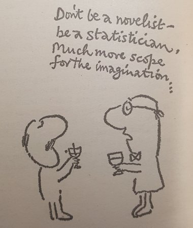
I bought this book many years ago when I was employed by the accounts department of a large UK firm to analyse the figures and produce reports for the board of directors on performance of all aspects of the business not just financial. Now you may think that purchasing a book entitled How to Lie with Statistics would suggest that these board reports may not have been entirely accurate; but in fact I got it for the same reason as it was written because if you know how things can be done badly then you can avoid making the same ‘mistakes’. Unless of course you are trying to show something, or more likely hide something, in the numbers, in which case the book becomes even more useful as a source of helpful hints. Rereading it at a time when we are bombarded with statistics and graphs (oh how a lover of selective data loves graphs) relating to the global pandemic of Covid-19 adds a useful dose of cynicism which we could all do with and the cartoons by Mel Calman are as pointed as they so often are.
Averages and relationships and trends and graphs are not always what they seem. There may be more in them than meets the eye and there may be a good deal less.
The book is full of examples of misleading statistics either real ones or created data to illustrate a point, for example just what is an average? Now the lay person reading that the average of something is say five will assume that tells you something, but which definition of average is being used? There are after all three main types all of which can give wildly different results depending on what you want to prove. The mean is what most people assume is an average that is add up all the numbers and then divide by how many numbers are in the sample. But then there is the median which is simply the middle number if you write out the data in numeric order, now this is useful for getting rid of weird data in the sample, the series 1, 3, 3, 5, 7, 9, 147 has a median of 5 which is ‘probably’ more useful than the mean of that data set which would push the ‘average’ much higher than all but one of the numbers in the set but it can also be misleading if that answer of 147 turns out to be important and you have simply ignored it. The only other average most people will come across is the mode, now that is simply the number that occurs most often so in the previous example that would be 3. So is the average 3, 5 or 25? Well it depends what you want to prove all of them are legitimate averages. In the book Huff uses a similar example where the data is household income, if my sample is also monthly income in thousands of pounds then all we have proved is that this particular group probably includes a professional footballer on £147,000 a month. Saying that the average is £25,000 a month is meaningless unless you want to imply that this is a particularly wealthy neighbourhood to property investors that haven’t been there but under one definition it is the average income, so should they build a Waitrose or an Aldi supermarket?
Each chapter features different ways of presenting data starting with samples with built in bias. A postal survey asking if people like filling in postal surveys may well show that 95% do, but unless you also know that they sent out 100,000 surveys and only got 250 back you don’t see the 99.75 percent of people polled that so dislike filling in postal surveys they simply threw it away. A famous real example of this mentioned in the book is The Kinsey Report on the sex lives of Americans in the 1940’s and early 1950’s. This report claimed to be revolutionary and is still cited but how many people back then were going to be willing to take part in the survey? By the nature of the responding sample we have another self selecting group biased towards people who are more open about their sex lives and preferences and may also on that basis be more experimental therefore skewing the results.
But to really lie with statistics you need a graph which is why politicians and marketing departments love them so much, one of the examples in the book is reproduced below and shows a oft repeated trick to make figures look more impressive, truncating the vertical axis, both graphs show the same data but have a different title to reflect what the story is.

Another popular trick with graphs is to start or stop the range displayed to avoid including inconvenient data, if a graph based on monthly figures doesn’t start in January or maybe starts in 2007 (which seems an odd year to choose unless mapping something that did actually commence then) always ask the question what were the figures that preceded those displayed, likewise if it appears to stop at a random point then that is probably where the data stopped matching whatever the person drawing the graph wanted to prove.
Percentages are also to be looked at carefully, percentage of what precisely is always a good question. If something is £10 now and £15 next year it is 50% more expensive but the reverse isn’t the case, something £15 and £10 next year is 33% cheaper however it’s amazing how often you see the figure of 50% being used, an example is of the president of a flower growers association in the US who claimed flowers are 100% cheaper than they were last year, what he meant was that the price last year was 100% higher than now, if they were really 100% cheaper they would have to give them away. There are lots more examples in the book and you don’t need any mathematical knowledge to understand any of them, Huff is really good at explaining just why you should be always looking twice at any statistic and the more simplistic the way it is presented then the more cynical you should be.
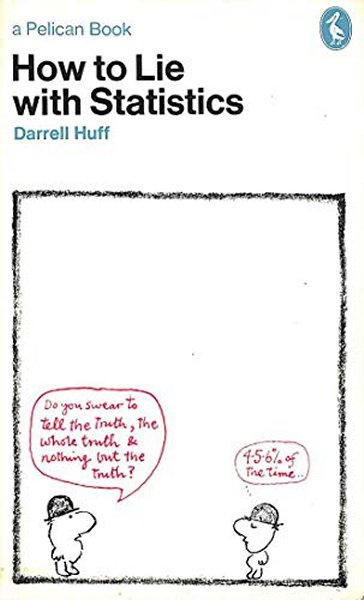
Darrell Huff wrote this classic back in 1954 and it was then published by Victor Gollancz and first editions now sell for many hundreds of pounds. This is the 1973 first Pelican Books edition and it was Pelican that commissioned Calman’s drawings and is much more reasonably priced. It doesn’t appear to still be in print but copies are easy to find on the secondhand market. Now more than ever this book is needed.