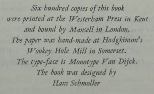
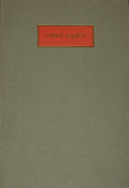
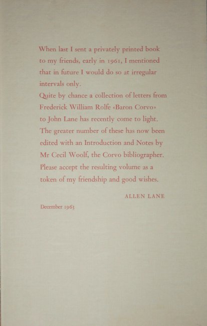
Another of the Allen Lane Christmas books is my featured work for Christmas week. This time the book consists of one hundred letters from the self styled Baron Corvo to John Lane, the founder of The Bodley Head Press. It was sent as a very limited gift of just six hundred privately printed copies in 1963 as can be seen from the enclosed sheet of paper from Allen Lane which is reproduced below.
The paper for the book is hand-made with the distinctive ragged edges that such sheets often have if not trimmed which gives the book a lovely look and feel and it would be a pleasure to read is it wasn’t for one issue which I have mentioned before about another book. That is that the very helpful notes are all combined at the end so the reader is forced to use two bookmarks or repeatedly thumb through the pages looking for information. That these notes are necessary is due to the elusiveness of Corvo himself and the fact that what he did write about himself is not to be trusted, so you are regularly searching for context within the letters.
Frederick Rolfe aka ‘Baron Corvo’ was a strange and difficult to pin down person. He claimed the title from time he spent in Italy with an Italian nobleman who apparently granted him the name Baron Corvo but this is probably not true. That he had talent as a writer and artist is however undisputed but often his abrasive and wildly changing personality caused conflicts with those whom he most needed for support and he definitely endured considerable periods of hardship. Looking back over more than a century he is fascinating but not somebody I would have wanted to have anything to do with.
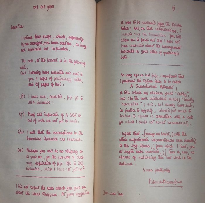
The book includes two of the letters as facsimiles, including the example below where you can see his bold handwriting but also his odd choice of red ink for correspondence. Indeed Corvo used a wide selection of coloured inks for his letters and if all the letters had been in facsimile the book would have been a positive rainbow.
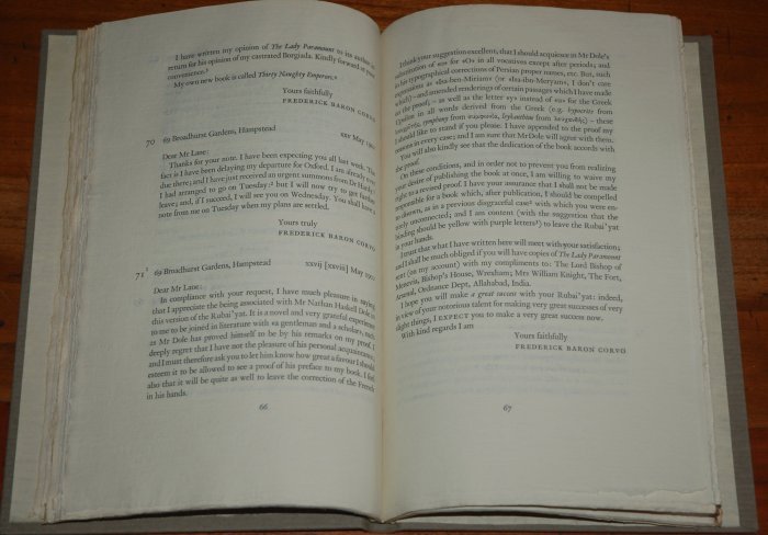
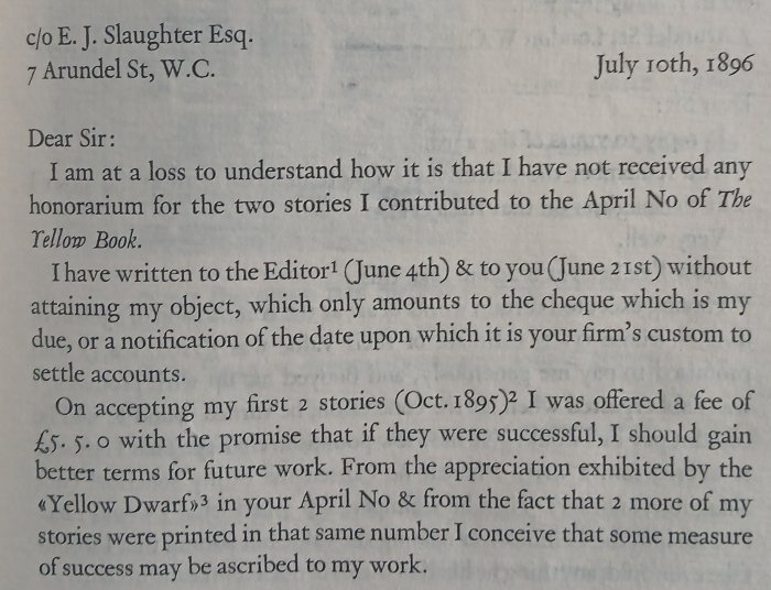
But let’s get to a proper selection of the letters which concern initially possible printing of more of Corvo’s ‘Stories Toto Told Me’ tales, several of which had been well received when published earlier in volumes seven and eleven of ‘The Yellow Book’, which was a Bodley Head i.e. John Lane publication. Over the years a possible illustrated edition of the Rubaiyat of Omar Khayyam was also mooted and the letters become more concerned with that. As the book is rare I have included a few letters so you can get to have a feel for the man, beginning with this letter chasing payment, and all too familiar theme in all of Corvo’s correspondence, from July 1896.
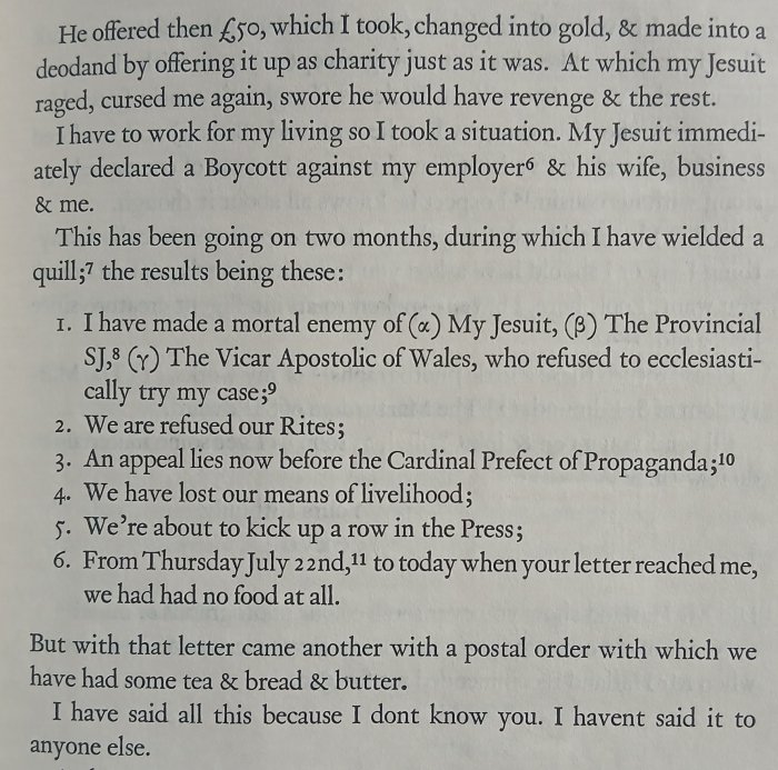
A year later, July 1897, and this is the second half of a letter which is happier in that he had received payment, which he had then given away principally in order to annoy the priest that gave him the money. I will go into more about what had happened here and some of the basis of his feuding with religious authorities next week when I dig more into the man behind these letters.
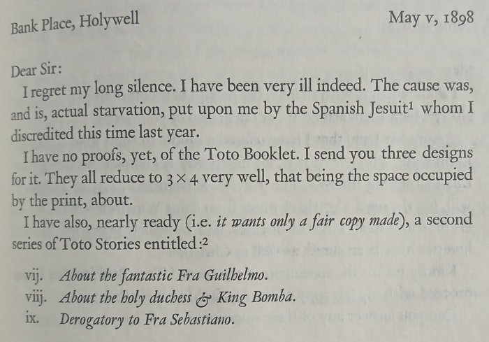
By May the following year Corvo was still in dispute with the church in Wales, but is also still trying to follow up what is happening with his Toto stories and is getting increasingly frustrated with Lane’s lack of replies to his numerous letters. It should be noted that a long silence from Corvo would only be a matter of weeks as he was a prolific sender of letters.
The next letters I have chosen from the hundred in the book are three years later, from 1901 where we see the first of numerous chases for what is happening with the Rubaiyat but also in the second one here a firm statement of his intention to remain private. It is this secrecy, and indeed the choice of different names he would use not just in print but whilst living in locations where he wasn’t already known, that makes tracking down Corvo and what he was actually doing from time to time so difficult.

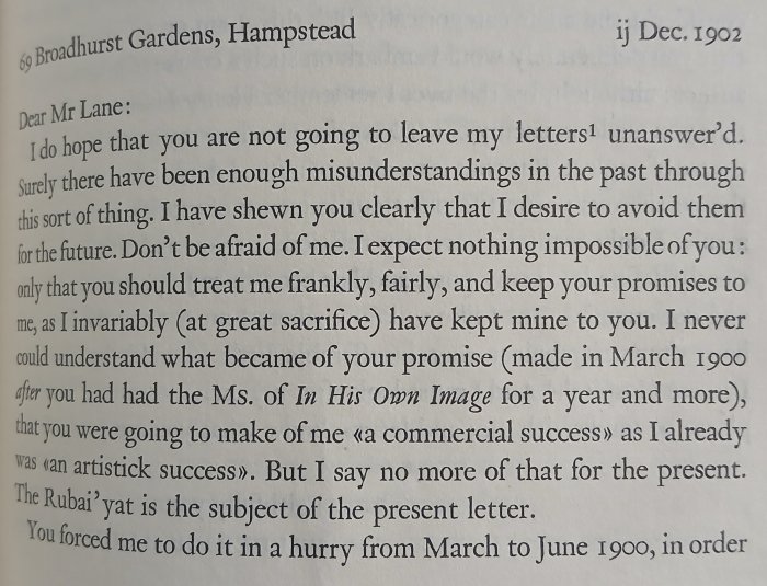
The start of the next letter, December 1902 has the familiar complaints of lack of response and more chasing of the Rubaiyat, I don’t think this was ever published however. In Lane’s defence he was known to be poor at replying to letters and the sheer number he was getting from Corvo was likely to make him even less prone to keep up a two way correspondence.
Finally I have chosen this letter from 1903 which is one of the sources of the title of this book, he uses the phrase ‘without prejudice’ several times whilst in disputes on various occasions.

So there it is, an unusual book for Christmas giving an insight into a distinctly unusual person published fifty years after his death. But who was Frederick Rolfe, aka Baron Corvo, aka Frank English, aka Frederick Austin, aka Fr Rolfe (giving the deliberate impression he was in the priesthood), aka ‘A Crab Maid’ etc. well more will be revealed next week when I review ‘A Quest for Corvo’ by AJA Symons.